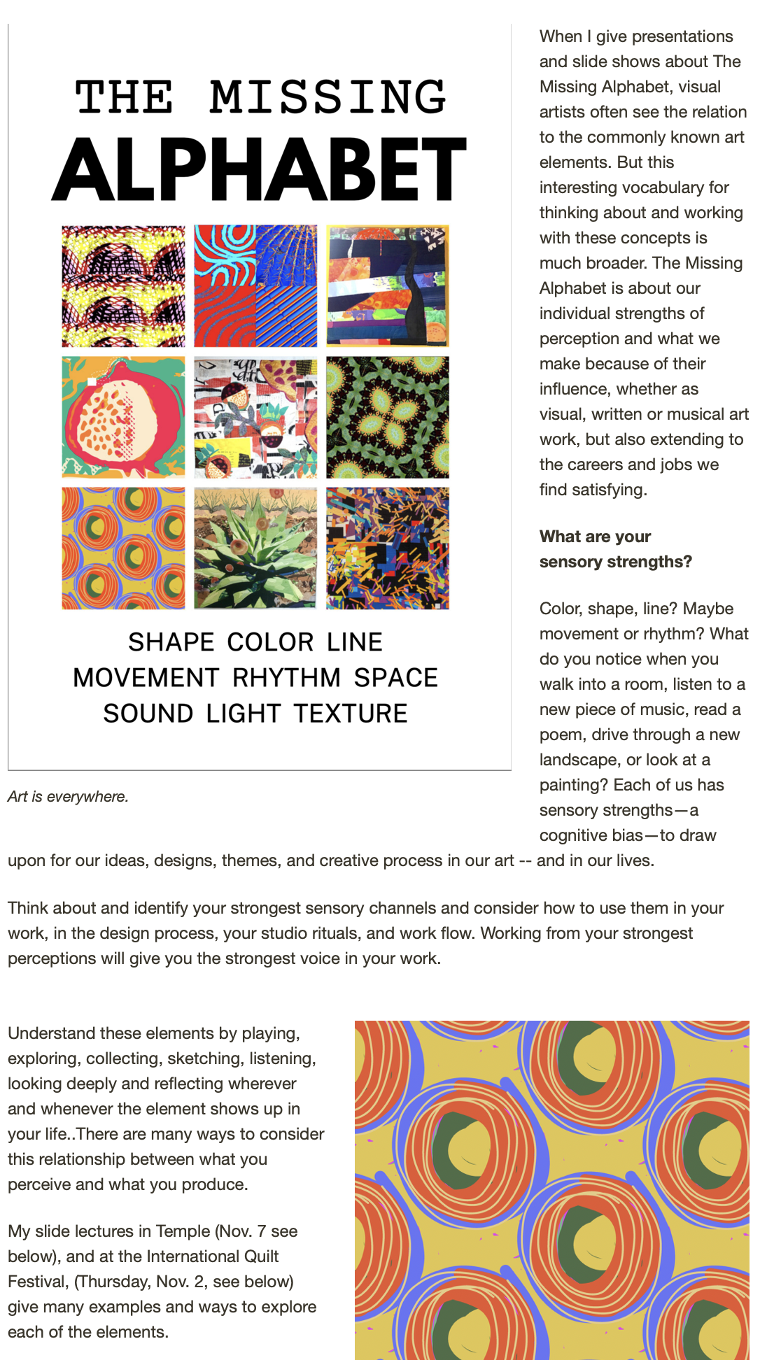
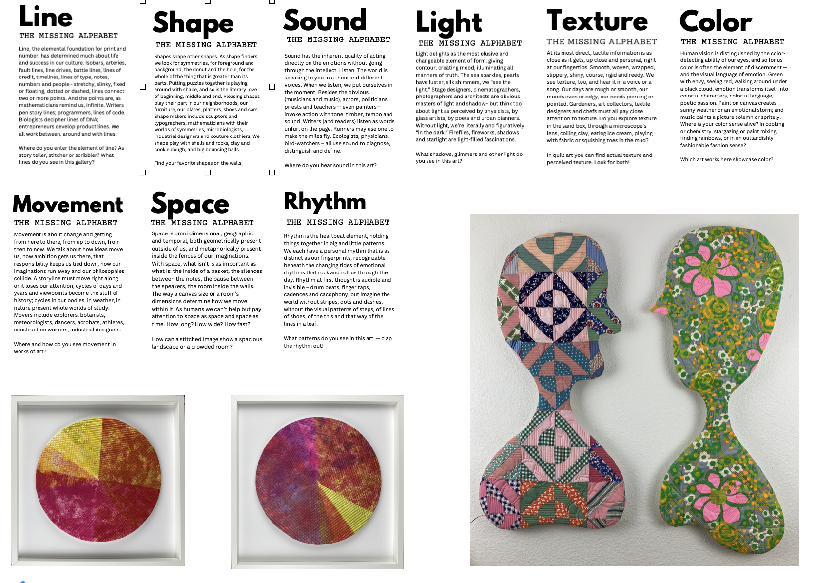
Working on a companion mermaid today, I thought almost obsessively about color. How this one is different ... how to make the pinky rose sea dance with another jade set of scales? How to make them work, if needed, on one wall together, but also swim alone? What little strip will make the whole composition pop? The story is always important to me; but color still comes first when it comes to putting it on the wall -- then shape and space running close on color's heels.
I always start with color. It's my strong suit, and the card I tip most often. Maybe it happened in 1958 (I was 10) with that first box of 64 crayons. Heaven, right?
 Lurking around on the internet during rest breaks from sewing Sunset Sirena #1, I found a multitude of sites about color, color theory, more color theory, color in all its screaming and whispering hues, color trends on the horizon, color sorted by Flickr groups, color used in marketing and selling to sort and organize, on and on and on. (See what you think of these and tell me about others that make you squeak-- I'm planning a color workshop in March.)
(And how about those "silent density," delicious palpitations," "sulphurous infusions," "precious blacknesses"?)
 Just as I was finishing the studio workday, I looked again at the photos I took this weekend -- just to find nature's perfect use of complementary color.


