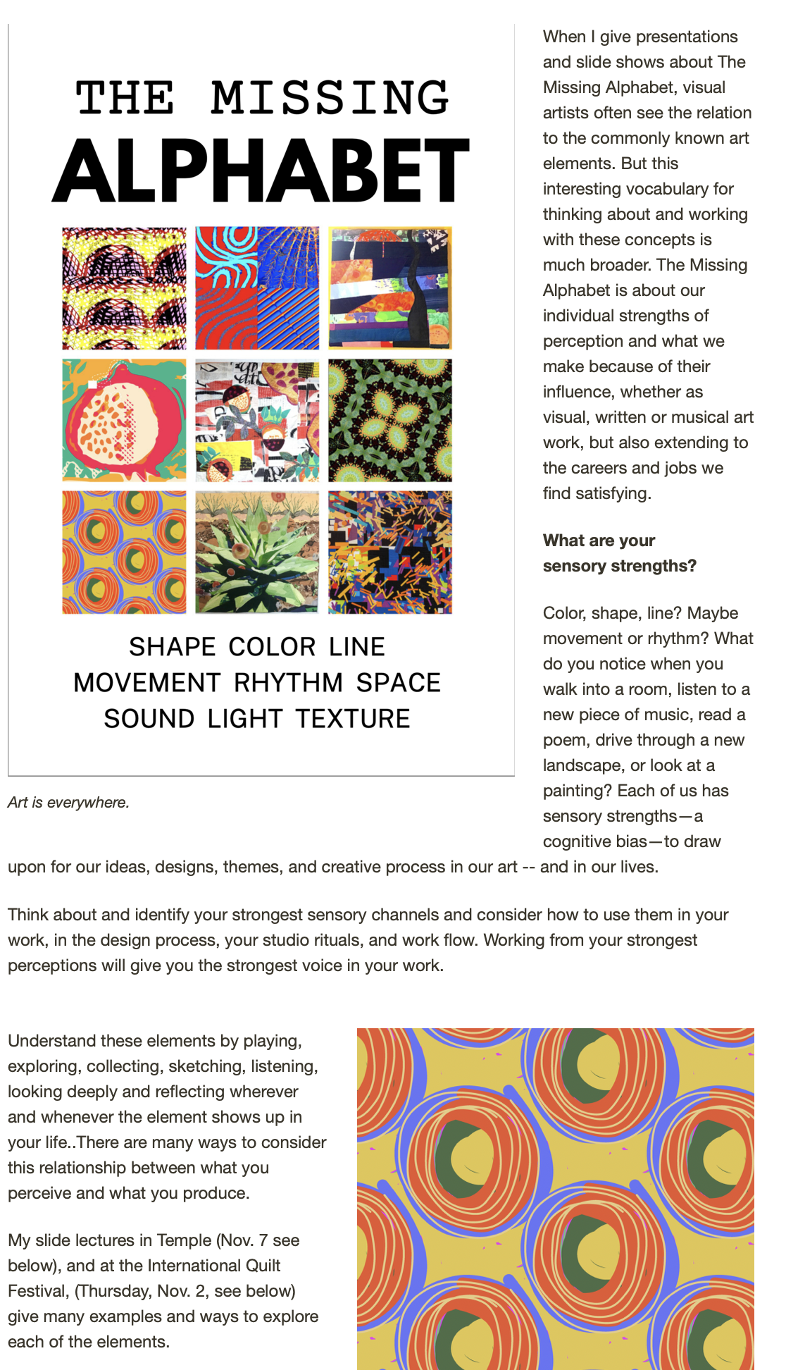
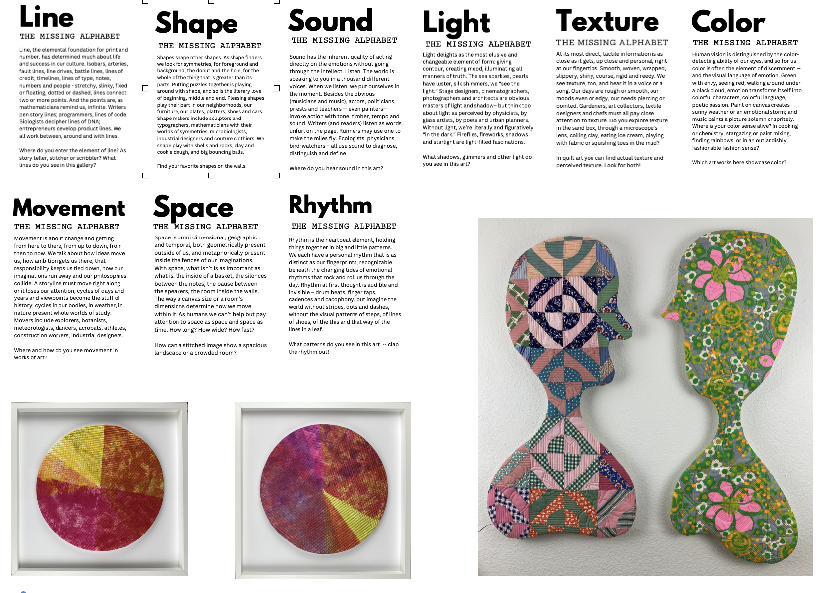
I set a goal last spring to start a quarterly newsletter to send to workshop participants, collectors, friends and family -- an emailed summary of the events and activities of my art life, and a few articles about the images, stories, natural history and materials that inspire my work. You may have received it if you're on my mailing list (or not, my list is still a mysterious and unwieldy thing) and if you didn't you can either check it out today by clicking on the link above for a downloaded pdf.
I will be repeating some of the information about shows and events, with more detail, here on the blog, so if this is your preferred window into El Cielo Studio, read early, read often!
Some reflections on the process:
The new tools available for work like this are nothing short of astounding. As a young woman, my first job was as a paste-up artist for
a shopper/neighborhood publication -- Suffolk Life -- out on the end of
Long Island during a brief residency after college. Each morning I took
long strips of headlines and shorter sections of shiny column width
text and built pages, ads, etc. It was tedious, exacting and
challenging for one whose acqaintence with a ruler is tenuous, but I
suppose to those who had once set metal rows of type for newspapers,
it was its own miracle of technology. Now, not only do I not need hot wax and strips of type, I don't even need paper. The photos float in; the type face changes with a whim. The choices seem overwhelming.
Publishing a newsletter takes bravery, chuzpah, ganas. As artists we who intend to sell our work (or teaching skills) must come to terms with shameless self-promotion. That little voice (well, not so little) announces with regularity, "Who the heck cares about your shows, work, ideas, blah, blah, blah." And then, get an "UNSUBSCRIBE" notice and it's immediately confirmed. (No matter that its only a few out of the several hundred sent.)
It's never going to be good enough. Just like making a piece of art work, doing something printish (or electronicish) is prone to its own learning curve. I hope the next one will be more interesting, helpful, compelling, intriguing. I'd like to get all of my work into a more consistent style and spend a little more graphic designer mindset on it. The choices seem mindboggling, so its quite easy to let the template designers do all the work for you. By the way, the software I used was PAGES, part of Apple's iWork suite of tools. If you're on a Mac I highly reccommend the modest investment for this software. It's taken time to get a hint of its capacity, but its been well worth the learning curve.


