


This weekend's "Field Guide to Color" put us elbow deep in hues and harmonies. Five of us went to the edge with hands-on explorations, more than a little bit of theory, and enough dyeing to keep the inner kindergartener happy indeed.
I'll get a few more pictures to post later from my new studio assistant Laurel Gibson (yeah, Laurel), since I have a major problem taking photos while I am teaching. However, the lovely swatches above should give you an idea of our color box projects.
Meanwhile, here's a sample of one exercise that is really helpful in training the eye to look at color:
1. Tear out a magazine photo or illustration and cut out a 2" square of one hue (color).
2. Try to mix that color using only primary colors (cadmium red, cadmium yellow and a nice medium blue -- throug in a fuschia red for colors that cabn't easily be mixed with a warm red) and white and black. See how close you can come to duplicating the shade, tone or tint. (shade=hue +black, tone=hue+gray or hue+complement, tint=hue plus white.
That's it. But you'll dind it a remarkable challenge and you'll also be surprised I think at how quickly your ability to mix these colors improves. You can also do the same thing with swatches of fabric or paint chips from the home improvement store.

We let them dry, then cut them out and added our paint chips to a handy file box of colors each participant put together -- in addiditon to the beginnings of a dye diary/dictionary. I forget how handy that is until teaching a workshop like this one reminds me of its use.

My next "Field Guide to Color" will be presented as a one-day workshop as part of the Contemporary Handweaver's of Texas conference in San Antonio on Saturday, March 28. My small art quilt, "Pomegranate Cross" will be part of the faculty exhibit for the conference, on display at the Southwest School of Art and Craft March 18-March 28 in the Russell Hill Rogers Lecture Hall at the Navarro Campus. The workshop is open to conference attendees, so if you are interested, please check their website for enrollment information.
For more color fun and games, try a peek at one or more of these color site links:
Color the White House purple or ??? (Shades of Sandra Cisnero's purple house controversy?)
This one is a designer's almost daily links to fab color and design sites around the weboverse.
Here's where to find a color blog that has lots of interactive games and posts. Look at the ones on saturation, hue and brightness.
One of severyl sites that generate color schemes from your photos.
The paint company has a cool site that lets you look at ways to find good color schemes for rooms -- and art.
Good info and online series of lessons.
And finally, on this long, but I hope helpful post, an excerpt from New World Kids; The Parents' Guide to Creative Thinking -- here's a few ideas about color from our book. If you comment on this or any of my posts or my guest posts on other sites at any time this month from Feb. 15 to Feb 28, your name goes into the raffle to win a free copy of the book.

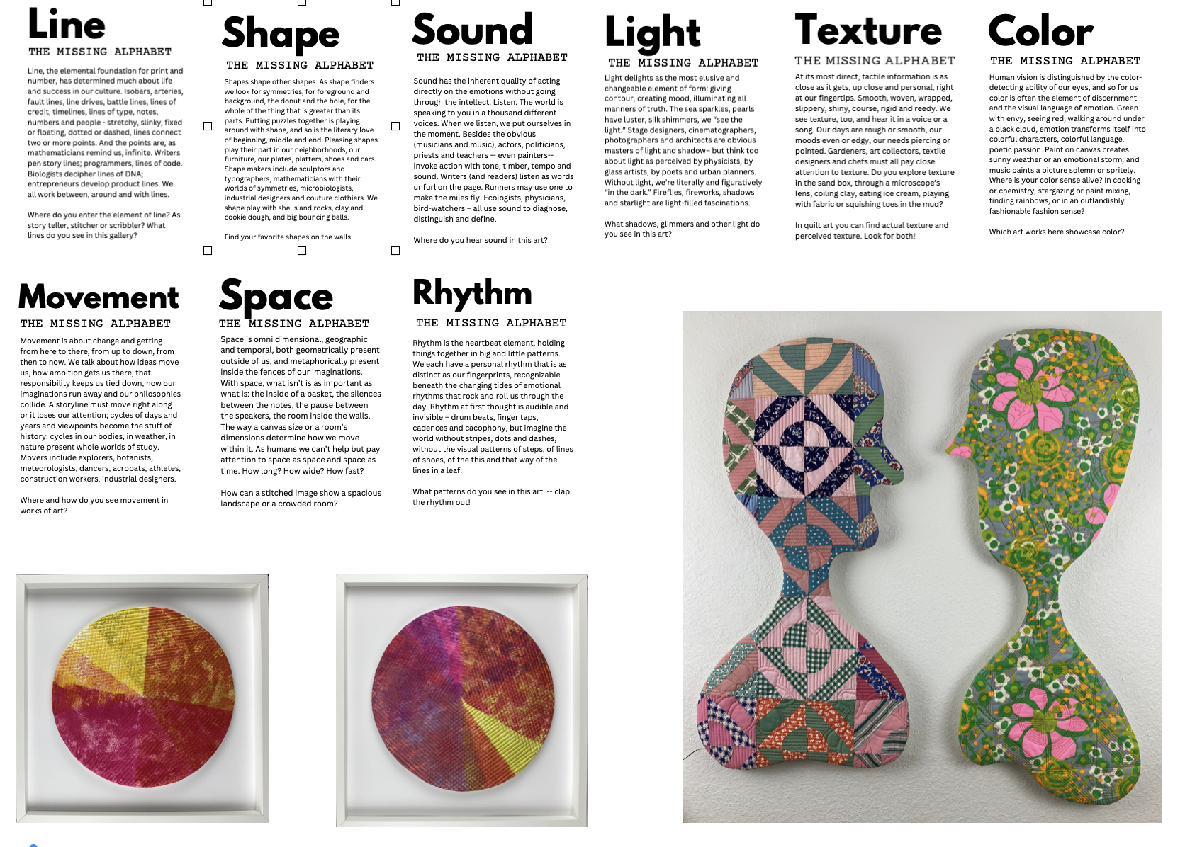
Color
Human vision is distinguished by the color-detecting
ability of our eyes, and so for us color is often the
element of discernment — and the visual language of
emotion. Green with envy, seeing red, walking around
under a black cloud, emotion transforms itself into
colorful characters, colorful language, poetic passion.
Paint on canvas creates sunny weather or an emotional
storm; and music paints a picture solomn or spritely.
Where is your color sense alive? In cooking or
chemistry, stargazing or paint mixing, finding
rainbows, delighting in a feather’s iridescence or
in an outlandishly fashionable fashion sense?
So, where is your color sense alive?