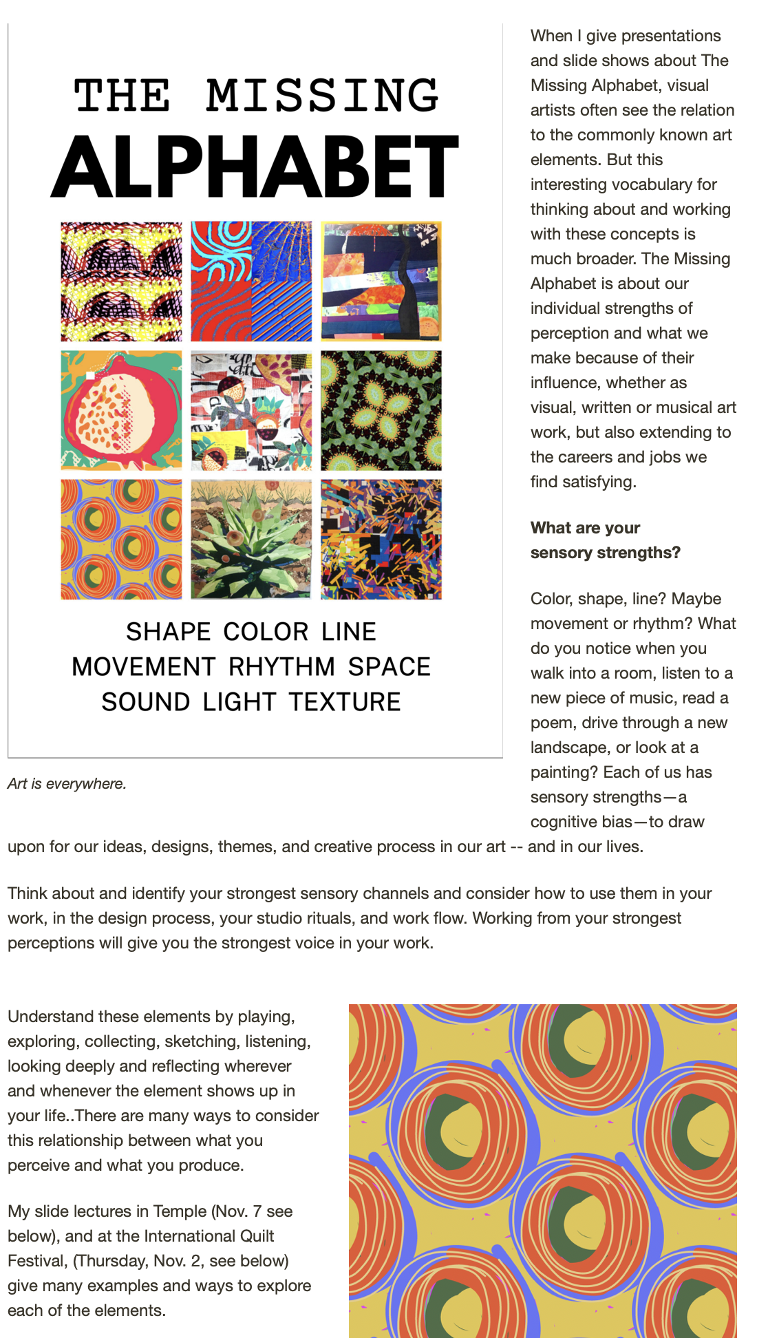


I recently learned that my art. "Faith is a Law" has been selected for includins in the special exhibit Text on Textiles, 2010 at the International Quilt Festivals in Houston, Cinccinnati and Long Beach next year. The piece was mulled upon and finally completed (just in time for the deadline) during the time I've been trying to complete my online course, Text on the Surface. (Yes, it is almost complete!)
As part of the course, I'm including some personal information that's not so much technique as it is philosophy of using text in a visual piece. Here's the excerpt from the course -- enjoy and consider signing up for the whole shebang, once I've made some tweaks and edits suggested by a loyal and persistent group of test pilots.


Read on for some ideas to play with, some approaches and some examples from my work and (eventually) the work of those who have taken this on-line course.

1. Use text as visual noise, purely as a design pattern, without much concern for specific word or language meaning. I do this often with sunprinted fabrics that have “noisy” background prints of letter forms. The art quilt “Too Much Information” below uses some background printed and batiked fabrics with text, plus more overt and content specific text that is embroidered onto the quilt surface.

2. Use text in a way that is both content and texture, as in the piece of red art cloth above. The writing is actually meaningful to me, but it is less likely to be read by a viewer than the embroidered text in the Twitter piece.
3. Use text as subtle design elements or content that enhances the story of your quilt. This quilt inspired by a visit to Lucca in Tuscany includes phototransfered images of the travel journal I kept on my trip, as well as embroidered text.


And this large art quilt, “She Steps...” has batiked “story words” circling the central figure.


4. Another way I sometimes use text is as big bold labels for the quilt, with almost equal weight as the images. The second example below is still waiting for stitching, one of a series of “Pears” using watersoluble crayons that I made as part of a DVD Workshop on Rainbow Printing.


5. Faith is A Law (above at head of post) uses text both as a textural design element and as a bold label statement -- but the boldness is made more subtle by the use of a light translucent gold stamp outlined by free motion quilting. This gives the message of the quilt quite clearly, uses text as a considerable design element, but avoids having it hit you over the head. Why this text on this quilt? The century plants have been blooming wonderfully this summer, spurred by the break in the drought. These plants, dispite the name, do bloom more frequently than a century, usually, but the mother plant, after waiting for the right conditions to bloom, dies, to leave room for the infant plants that spout from the base of the agave. The patience of faith to wait for the right time to bloom is a reminder to all artists to keep faith with our own time and pace.

Let me know your favorite way to include text on textiles. We'll share!