Palos Verdes Art Center

My work is part of this exhibition -- in the 24 by 80 Exhibit of Art Cloth. Art Cloth Network member Deborah Weir is the guest curator for the three exhibits. Please leave me a comment if you get to see it -- I'd love to know what you think! The exhibit is in California at the Palos Verdes Art Center in North Los Angeles.

My work is titled HUMMER, and was inspired by observing the black throated hummingbirds in the blossoms of the Century Plant. The exhibit features art cloth work unified by its 24" by 80" size by members of ACN. Art Cloth Network is seeking some additional members for its 30-member (max) national organization. If you'd like more info and a link to submission/application information, send me an email on the comment form or the contact form on the sidebar. 

Copper Shade Tree Gallery Opening

Just a few photos from the jam-packed opening, and the  interesting and always inspiring art from other Texas artists who participated:

Houston artist Peggy Sexton next to one wall of art -- the turquoise and yellow cactus piece is mine.


A gloomy, but still not too cool afternoon. The weather did not keep the crowds away!

This one, Agave and Madrone Leaves, is the piece I have in the show catalog -- you can buy it from Gerald and Debbie on line at the gallery site.

My large piece about the summer's drought in the middle above.

The two two orange and magenta pieces on this wall are Lisa Kerpoe's work.


On to Philadelphia!

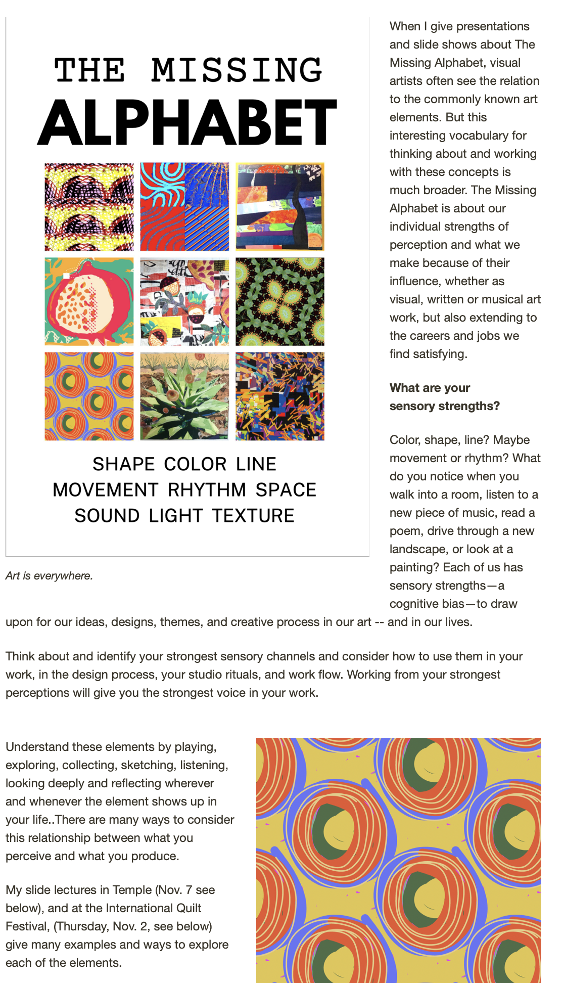
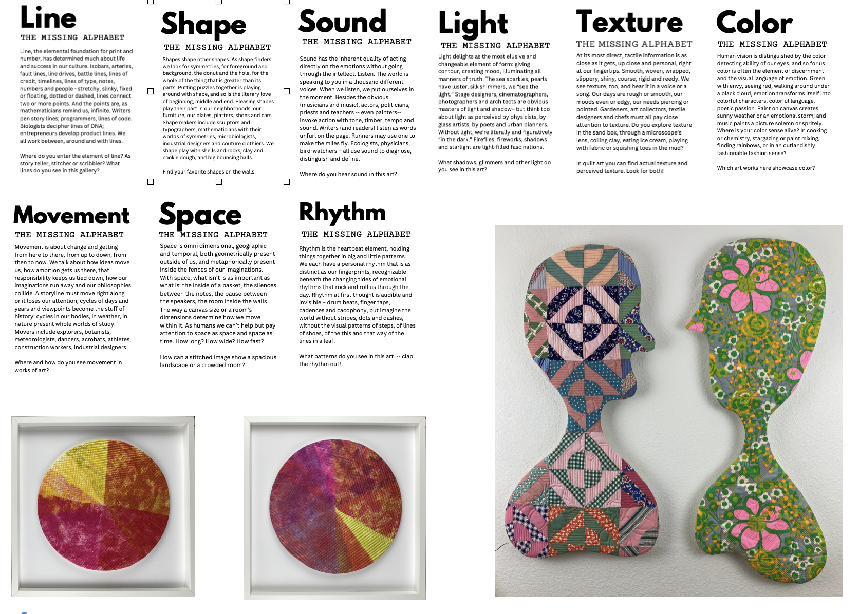
I wish! If I could do anything and money were no object, well, I would be there at the joint SDA and SAQA Conference and FiberPhiladelphia coming up in a couple of months. I am waiting for a sign from the universe that money IS no object, but it hasn't come yet!

One nice thing, though. I will be represented by a piece of work in the Art Cloth Network exhibit LINES AND NUMBERS, a combined exhbit of two juried shows, one determined by size and the other by the placement of a line in the fabric composition. Its just a treat to see how each artist handled these challenges, and each work shows the strength and voice of each individual.

If you'd like to see more, Barbara Schneider, one of the Art Cloth Network's team who has made this show possible (along with Dianne Hricko and Judy Langille, in particular), you can order a catalog from BLURB here: 

Lines and Numbers Two Exhibitions by the Art Cloth Network Barbara J. Schneider

http://www.blurb.com/bookstore/detail/2921362?utm_source=TellAFriend&utm_medium=email&utm_content=2921362


Barbara says:

If you go to this link (above) it will take you directly to our book. You have options then as to whether you want your copy to be soft cover or hardcover or with a dust jacket. The ones I ordered are black linen with dust jacket for $33.95 each plus shipping.  Soft cover is 22.95. I would not recommend the IMAGE WRAP hard cover. If you are planning to order before end of January they have a $10 off code NEWBK2012 if you spend over $50.  You can decide on shipping which reduces the cost of you don't need it ASAP.

Here's the piece I have in the exhibit (exhibit originally titled 24 by 90, juried by Els van Baarle).

This is a second piece inspired by the same sunny day walk by my neighbor's century tree agave, swarming with hummingbirds.

and here is a detail of the first:

Both of these pieces are available for sale, if you are interested send me an email!

Meanwhile: here's how they were done.

Both are adaptations of the process that I demonstrate in my QUILTING ARTS DVD "Mixed Media Textile Art," using screenprinting with multi-color printing, over stencils (the ironed on shapes of the agave and blooms and the shapes of the hummingbirds. I cut the design stencils, iron them onto the fabric (in this case a rather strange one -- blackout curtain material fused to poly felt). Then I color  a blank screen, using water-soluble crayons, that I  then lay over the stencil and screen print with polymer medium or screen-printing medium from Golden until the colors release and transfer to the fabric. The background of the piece is mostly done with just a blank screen using the same technique with a variety of different kinds of crayons, and added to with light acrylic textile paint washes. I then screen printed the little squiggly energy marks, kind of short hand for the movement of the hummers. The textured leaves were printed with a thermofax made from a microscophy image of leaf veins, and screened over the stencil of the agave leaf shapes.

If you'd like the basics about this technique, you can still buy  the DVD from Quilting Arts at:

http://www.interweavestore.com/Quilting/DVDs-Videos/Mixed-Media-Textile-Art-DVD.html

and see a sampler video at:

http://www.quiltingdaily.com/media/p/21091.aspx


Five Ways to Put Text on Textiles

I recently learned that my art. "Faith is a Law" has been selected for includins in the special exhibit Text on Textiles, 2010 at the International Quilt Festivals in Houston, Cinccinnati and Long Beach next year. The piece was mulled upon and finally completed (just in time for the deadline) during the time I've been trying to complete my online course, Text on the Surface. (Yes, it is almost complete!)

As part of the course, I'm including some personal information that's not so much technique as it is philosophy of using text in a visual piece. Here's the excerpt from the course -- enjoy and consider signing up for the whole shebang, once I've made some tweaks and edits suggested by a loyal and persistent group of test pilots.


Read on for some ideas to play with, some approaches and some examples from my work and (eventually) the work of those who have taken this on-line course.


1. Use text as visual noise, purely as a design pattern, without much concern for specific word or language meaning. I do this often with sunprinted fabrics that have “noisy” background prints of letter forms. The art quilt “Too Much Information” below uses some background printed and batiked fabrics with text, plus more overt and content specific text that is embroidered onto the quilt surface.

2. Use text in a way that is both content and texture, as in the piece of red art cloth above. The writing is actually meaningful to me, but it is less likely to be read by a viewer than the embroidered text in the Twitter piece.

3. Use text as subtle design elements or content that enhances the story of your quilt. This quilt inspired by a visit to Lucca in Tuscany includes phototransfered images of the travel journal I kept on my trip, as well as embroidered text.

And this large art quilt, “She Steps...” has batiked “story words” circling the central figure.


4. Another way I sometimes use text is as big bold labels for the quilt, with almost equal weight as the images. The second example below is still waiting for stitching, one of a series of “Pears” using watersoluble crayons that I made as part of a DVD Workshop on Rainbow Printing.

5. Faith is A Law (above at head of post) uses text both as a textural design element and as a bold label statement -- but the boldness is made more subtle by the use of a light translucent gold stamp outlined by free motion quilting. This gives the message of the quilt quite clearly, uses text as a considerable design element, but avoids having it hit you over the head. Why this text on this quilt? The century plants have been blooming wonderfully this summer, spurred by the break in the drought. These plants, dispite the name, do bloom more frequently than a century, usually, but the mother plant, after waiting for the right conditions to bloom, dies, to leave room for the infant plants that spout from the base of the agave. The patience of faith to wait for the right time to bloom is a reminder to all artists to keep faith with our own time and pace.

Let me know your favorite way to include text on textiles. We'll share!