Looking Beyond the Art Village Where We Live

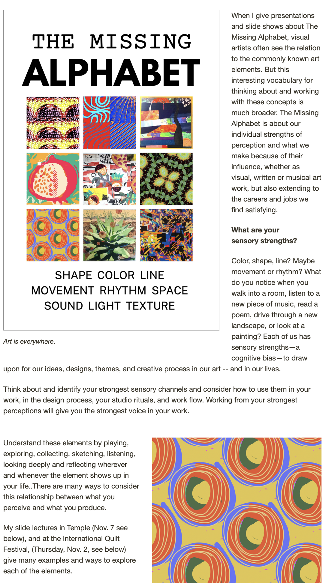
We fiber artists live in a very rich and connected community. And sometimes (often, actually) it's important to travel outside to see what other "countries" in this universe of art are up to. The valuable messages may come in the form of technical tips, some new materials that could enrich your own work, or in broader messages about the business and/or creative trajectory of being an artist. 

This great podcast showed up on my phone this morning on my commute into Palo Alto College for more bookmaking with the Centeral American teachers. If the copy and link don't show up for you, you can find the page link to the Design Observer site here. Louise Fili is a wonderful typographer, designer and inspiration to those of us who like to include text and lettering in our work. This interview is a wonderful reminder about the power of timing, about paying attention to opportunities and the importance of  taking what my coach Lesley Riley calls "imperfect action."


"AUDIO DESIGN MATTERS 2009-2012

Louise Fili

Louise Fili designs specialty food packaging and restaurant identities, and is pazza for tins that speak Italian.  A graduate of Skidmore College, Louise designed books at Alfred A. Knopf in the mid 70's, worked for Herb Lubalin from 1976-78 and then joined Random House as Pantheon’s art director in 1978. In her eleven-year tenure as art director of Pantheon Books she reinvented book jacket design. Louise’s passion for 1930s Italian and French poster design migrated from her book covers to her restaurant design. You can read more about Louise in the  introduction to her most recent book, Elegantissima


Designing with Type Shapes

As part of my online Joggles course (get the full story here) I'll be doing an occassional post here that my online students can use for further ideas; maybe those of you reading along can pick up a tip or two as well.

I've been pondering collage design with type and "found letters," those cut from magazines and newspaper or even spit out in differing sizes from your computer font library. Putting them together quickly, then arranging, rearranging and copying out bits and pieces in differing sizes is how I like to work on these random text collages -- I am not necessarily going for a literal message, more just the feel of type as shape and form and texture. But there is also an interesting challenge in using the letters of a meaningful or intriguing word that you might want to have as a kind of hidden message in a piece.

For example, this piece, while primarily a strong and bold composition, with text that pops out -- mas (Spanish for more) and LIFE from the classic magazine title -- also includes the "hidden message" "music." Each horizontal pieced  band of fabric is a repetition of each letter M, U, S, I, C in order. 

Here are some tips that may help you make some interesting collages with your type collections:

1. Work with CONTRAST:

SIZE -- Use as wide a variety of sizes as you can. Collage the letters with varied sizes as neighbors to those of other size.

VALUE -- Use strong contrast in value for the best copies -- black on white, red on white, dark hues on light pastels (AND vice versa) Avoid type -- or limit it -- that is too close in value to the background. Yellow reads as white and pale blues disappear on almost all copy machines

DIRECTION -- GLue the letters down in different directions, try to make a "patchwork" of letters facing different ways, upside down, left to right, right to left.

2. PATTERNS

Try these different ideas as ways to glue down a text collection -- think of different rhythms and different patterns to develop collages that have different feelings and messages in their composition:

swirling letters

marching across the page letters

letters lined up and making another shape

a tornado, a wave, a spiral, a crawl, a race, a path, windows in a house, people in a crowd, letters arranged to make animal shapes or objects. (Like concrete poetry, but letters only) See the alphabet video here for examples:

Letters on stage performing for other letters

3. Follow the rule of 3s

Use similar elements or copies of the same letter forms in odd-number arrangements: 3s, 5s, 7s. For some reason odd numbers of related shapes (etc.) always seem to work better in compositions.

4. GROUPS not POLKA DOTS

Arrange letters and elements close enough together that your eye "reads" the design with continuity -- just enough space between the elements (shapes, lines, dots, stripes, letters, etc) that your eye can easily leap to the next element, especially if it is a repeated element. Also, try to vary elements spacially, paying attention that you don't set up too regular a pattern (like polka dots) unless that is the rhythm you are trying for.


Designing with Text, Up in the Cloud

In a nutshell, it's Wordle. 

http://www.wordle.net/

The graphic above is the word cloud generated by Wordle using the text in this blog site! You can use any site, any text block, anything you want to type into the program or copy and paste. It's fun to scroll through the gallery, too. Lots of design uses for this program!

This is a great word cloud design site, passed along to me from Caryl Gaubatz via Pat Schulz, who knows my interest in text on the surface. I'm posting it here, not only to share, but I find that it's helpful to use my blog as a kind of electonic filing cabinet of ideas I want to explore more!

MORE: the developer of Wordle referred me (via his posterous page) to another, newer word cloud design generator -- http://www.tagxedo.com/app.html 

With Tagxedo, you can also put the cloud into a specific design shape or form and manipulate more of the criteria for the design. 

Art with CAYA -- Youth Ambassadors


The week flew by with work at Bamberger Ranch and then at Southwest School of Art with the CAYA group, Texas host kids and families and the year-long residency group of SEED teachers. On this post, we just wanted to share some of the graphic and visual forms we worked on -- you can see more photos of the various aspects of the program, and the kids at work, on the Posterous SEED blog, if you're interested.

This is what I love about these graphic forms, and why I think they work as collaborative art projects:

First,  limit the palette in use  to some degree -- kraft paper brown, black, white and red  construction paper were the choices here (We loosen up on these color restrictions as the day goes on, figuring that the repetition will hold the general design together).

In the projects, we emphasize cutting over drawing or sketching. First, its less intimidating for kids who don't think they are good artists. Secondly, it keeps things simple and strong and bold. Black cutout letters and shapes are the bones for any little fussy stuff on top!

The t-shirts start with cutout "logos' for air, earth and water. Each kid makes a logo. I gang them together reduce each to a grid that will fit on a thermofax and the kids get to print their own shirts. Then, with colored fabric markers, each one can individualize and personalize his or her design. Again, the black ink on white shirt holds the whole design together.

The "dream towers" included collage work (each person cutout  a large word that described a personal dream, then collaged it with magazine pictures), a few notan designs, etc. Again, the color palette holds it together. I used the model of the Eames "house of cards" as patterns for the large foam board cards. These notch together with slits and make relatively stable and sturdy set/exhibit pieces that can be easily stored, recycled with new images with a new group, and infinitely rearranged. Since our final exhibit and presentation was in a gallery where we could not attach anything to the walls, these towers provided display space for work -- and they could be quickly assembled and disassembled and moved easily in the van or even a passenger car backseat!

The black foam  board cards were just taped into triangles (for stability) and stacked on top of each other. Kid wrote their recipes and remedies and cures for issues facing their world on these with chalk -- again, the boards can be wiped clean and reused. The blackboard form was fun, gave shape to the thinking and message, and was un-intimidating since if one made a mistake you could erase and do it again. And I love the black and white with the other forms.

The mask forms are simple paper bag masks using limited colors and mostly cut out shapes and forms. The kids (each in their group of either water, earth or air) chose a creature or element to personify as a mask and to "speak" for -- their assignment was to be a voice for those without words -- the animals, plants and elements of nature that depend upon survival with our solutions for the difficult problems facing the environment and our stewardship of the world, our partnership with the rest of the world. We used recycled packing materials from our lunches and other meals in these, as well.

After years  (and years) of doing collaborative (and quickly produced) art forms with kids and adults with all kinds of content, I do have my bag of tricks and approaches that help with visual strength and form, but still give everyone the sense of personal contribution and expression. I think that providing a few "rules" in terms of setting a strong format, limiting materials, and structuring the work experience all add up in the end.